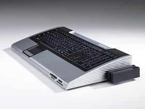
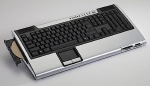
I’m guessing we all love new technology. (hopefully) It’s fast and small with either a shine or a classy matte finish. But do we not also love technology that looks like something you wish you had several decades ago? How about something you wish you had several decades ago that has been awkwardly updated? Yes? Then say yes to the Phoenix!
Apple got it backwards with their iMac bullsling. I mean, why build a monitor with a computer in it when you can build a keyboard with a computer in it! But serioulsy, how cool is this? So cool that I sincerely sort of want one. Commodore’s latest powerhouse has what you would expect from your average present day computer with all the USB ports, card readers and expandable memory. It also ups the anti with dual VGA and DVI outputs, supports your choice of around 6 different operating systems and even seems to have a point of sale swipe style card reader! Say What?!

OK, I admit there are some very suspicious things going on here. I mean, even the keyboard…I mean computer itself looks a little screwy. As much as I like it, the tiny pit where the even tiny-er trackpad is is a little weird. Second, how come the resolution of all the photos are so low that the images look jacked up for their size? Since we’re on the topic, the website itself seems to have a jacked up look of it own. Now not that I want to start nitpicking, and as much as I appreciate alternatives to the standard .com address, I must admit, I was really not expecting a .net on this one. Oh wait a second, a few things might be explained from checking out the Profile page…huh, what do ya’know.
I’m not ashamed to admit I’m a little confused on this one. Either way, still not sure if I should order now or wait til the third quarter of 2010 for the official launch.
Tags: Chillerman1602, consumerism, Electronics, Mobile technology
